

Pressiona Logo Redesign
The logo redesign for Pressiona focused on elevating the brand’s presence to match its role as a modern basketball agency representing international talent. Operating at the intersection of career management, marketing, and player development, the brand required an identity that felt both professional and performance-driven.
The original logo, centered around a hand holding a globe, communicated support and global reach but felt overly literal and lacked the clarity expected from a contemporary sports agency.
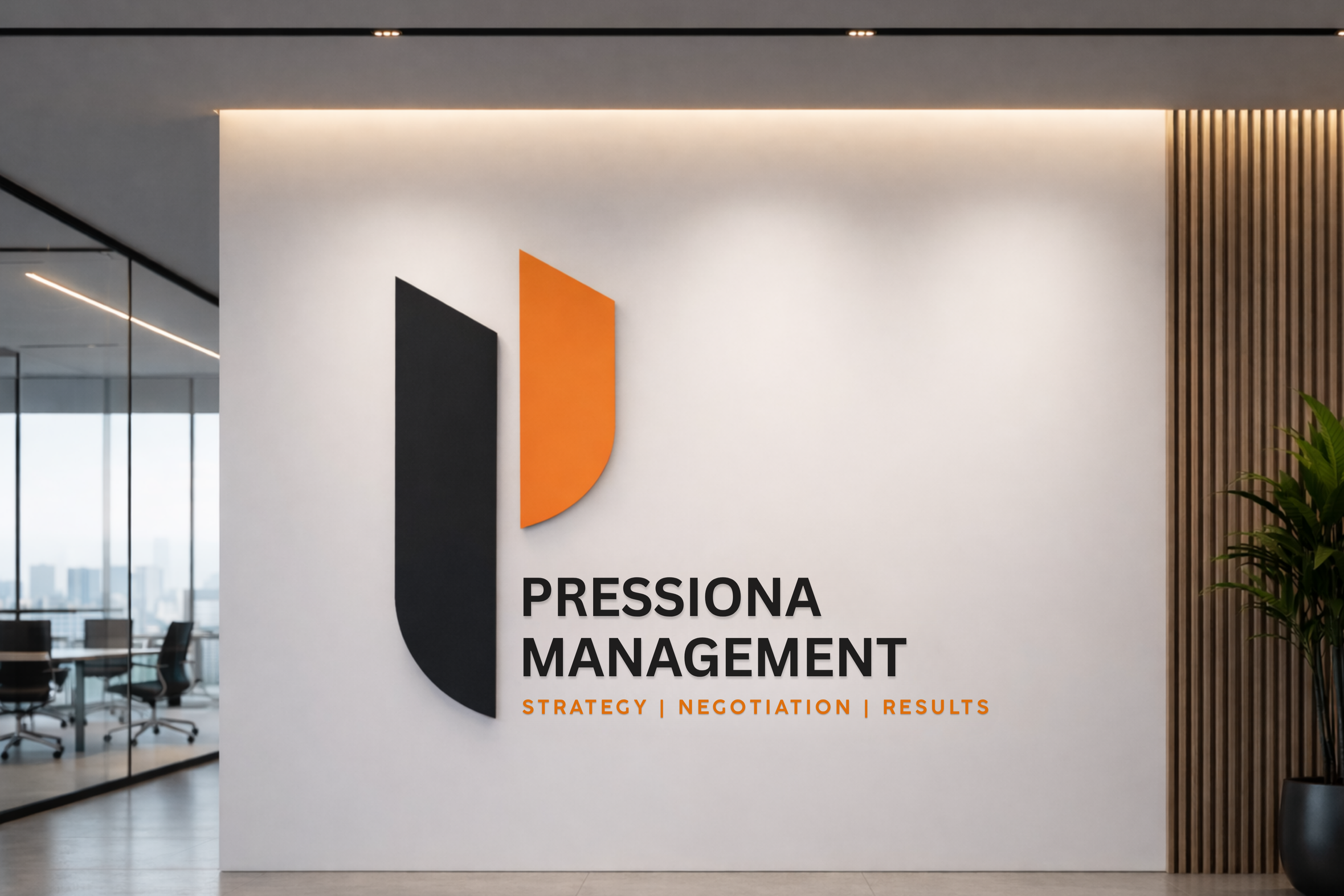
The redesign shifts the brand toward a more refined visual language. A bold, minimal “P” mark was introduced, built from sharp geometry and contrasting black and orange forms to create balance, movement, and strength. Subtle inspiration from the rhythm of the game informs the structure, resulting in a mark that feels dynamic yet controlled.
Typography was simplified to improve clarity and scalability across digital platforms, player materials, and social content. The system performs seamlessly in both light and dark environments.
The result is a streamlined identity that reflects Pressiona’s core mission of adding value to players, while positioning the brand with confidence in a competitive sports landscape.

Previous Logo

Redesigned Identity
